Not sure if you should go tall or low? This practical guide breaks down visual impact, guest conversation, table shapes, venue rules, and cost—plus when to m...
Gathova
Table Numbers in Centerpieces Without the Clutter

Joanna Mercer
Joanna Mercer is an enthusiastic DIY event decorator and the creative spirit behind Gathova's party guides. With years of hands-on experience designing stunning tablescapes, balloon garlands, and custom photo backdrops for friends and family, she specializes in accessible, budget-friendly celebrations. Joanna loves sharing her practical tips and crafting tutorials to help anyone turn an ordinary space into a memorable party venue.
Published · Last updated
I learned this the hard way at a backyard birthday bash I styled for a friend: my centerpieces were adorable, the table numbers were necessary… and together they looked like a tiny paper forest blocking everyone’s view. Since then, I treat table numbers like a design element, not just logistics.
The goal is simple: guests should spot their number in one glance, and then forget it’s even there because it blends into the decor.
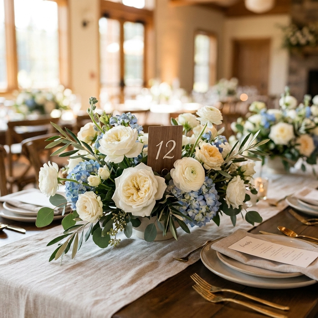
The 3 rules that keep numbers from looking messy
1) Give the table number one job
If it’s a table number, let it be that. Don’t also make it the menu, the QR code, and the full wedding hashtag manifesto. When the sign tries to do everything, it reads as visual noise.
2) Match the visual weight to the centerpiece
Think of visual weight as how loud something looks. A thick acrylic block, bold black font, and a shiny stand can overpower a delicate bud vase moment. A wispy card can disappear next to a dramatic floral arrangement.
- Delicate centerpiece: choose smaller numbers, thinner stands, softer contrast. If it still feels too bold, swap a glossy stand for a matte clip or a clear holder.
- Bold centerpiece: choose a slightly larger number or a sturdier holder that feels intentional. If it’s getting lost, keep the sign low but bump up contrast with darker ink or a thicker font weight.
3) Protect guest sightlines
If people have to lean around your number to talk, it’s too tall or placed in the wrong spot. My rule of thumb is to aim for these “friendly conversation” heights as a starting point:
- Low centerpiece: table number under about 8 to 10 inches tall
- Tall centerpiece: place the number low at the base, not at the top
If you’re debating low vs tall centerpieces in general, this pairs nicely with Tall vs Low Centerpieces.
6 placements that look styled
1) At the base, slightly off-center
This is my go-to. Place the number at the “front corner” of the centerpiece base, not dead center. It looks curated and keeps the arrangement as the star.
- Best for: compotes, low bowls, clustered bud vases
- Pro move: angle it slightly toward the main guest approach path
2) Tucked into the greenery line
If your centerpiece has a garland runner or a grounded greenery moment, slide the number into that line so it reads like part of the landscape.
- Best for: eucalyptus runners, ivy trails, bud vase lines
- Avoid: sticking it in so deep guests have to hunt for it
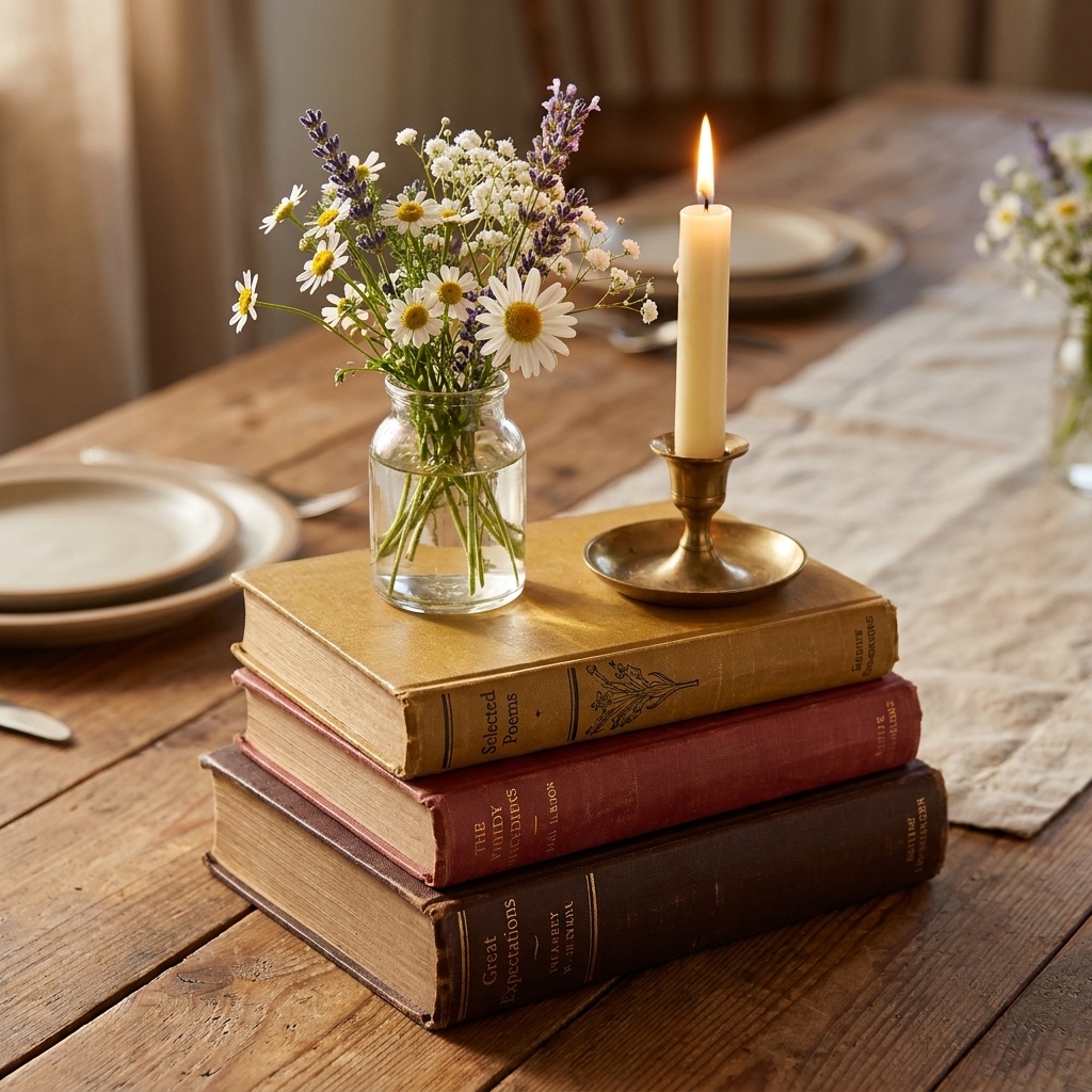
3) Leaning on a riser or book stack
A small riser gives you a natural place to rest a number without adding another stand. This works especially well when you’re using height strategically.
If you love the cozy, collected look, see Hardcover Books as Centerpiece Risers.
4) Mini frame laid low
Instead of a vertical sign, try a small frame set at a slight angle. It reads like part of the tablescape styling, not signage.
- Best for: intimate dinners, showers, holiday tables
- Keep it calm: a thin, neutral frame won’t compete with your florals
5) Wrapped around the vase neck
This is cute and shockingly clean looking if you do it simply. Use a small tag-style number tied with ribbon or twine around the neck of a bottle vase or bud vase.
- Best for: bottle centerpieces, single-vase centerpieces, thrifted glass
- Tip: keep the tag small so it feels like a detail, not a label maker moment
6) On the table, not in the centerpiece
Sometimes the simplest fix is to stop forcing the number into the arrangement. A flat, place-card-style number near the centerpiece can look intentional and keep the centerpiece visually pure.
- Best for: very sculptural florals, lots of candles, “less is more” designs
- Tip: repeat the number color in napkins or candles so it still feels cohesive
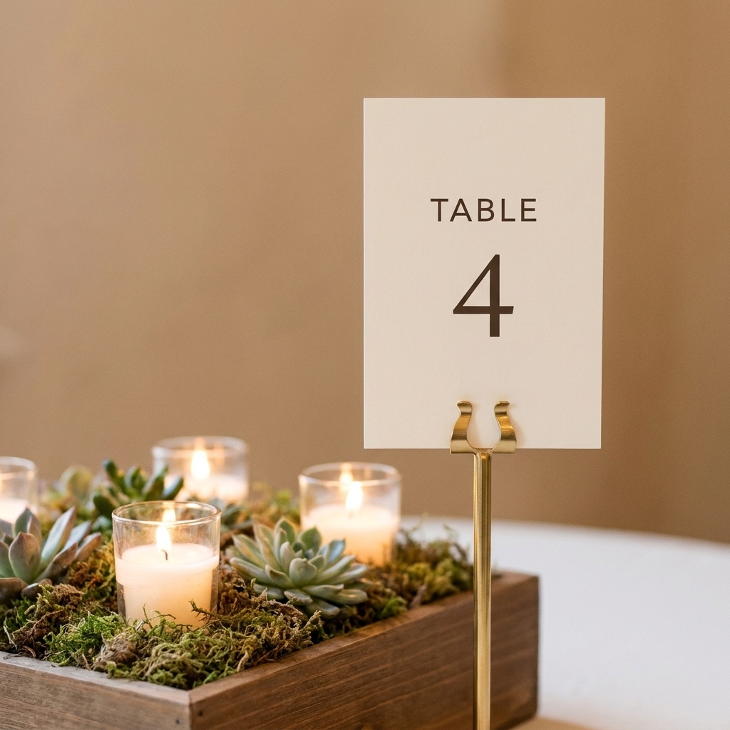
Holders that blend in
You don’t need a fancy custom stand for every theme. You need a holder that looks like it belongs.
Use what’s already on the table
- Candleholder: place the number beside a pillar candle or just behind it, with plenty of clearance from flame and heat, and never where paper can catch or get wax drips.
- Small bud vase: one tiny vase becomes the “sign vessel” that matches the centerpiece vases.
- Place card clip: great for minimal looks and small numbers.
Match your materials
- Warm, vintage tablescape: brass tones, wood, kraft paper
- Modern, clean tablescape: clear acrylic, white card, thin black type
- Garden look: soft cardstock, deckled edge paper, simple ribbon tie
Foam-free centerpiece bonus
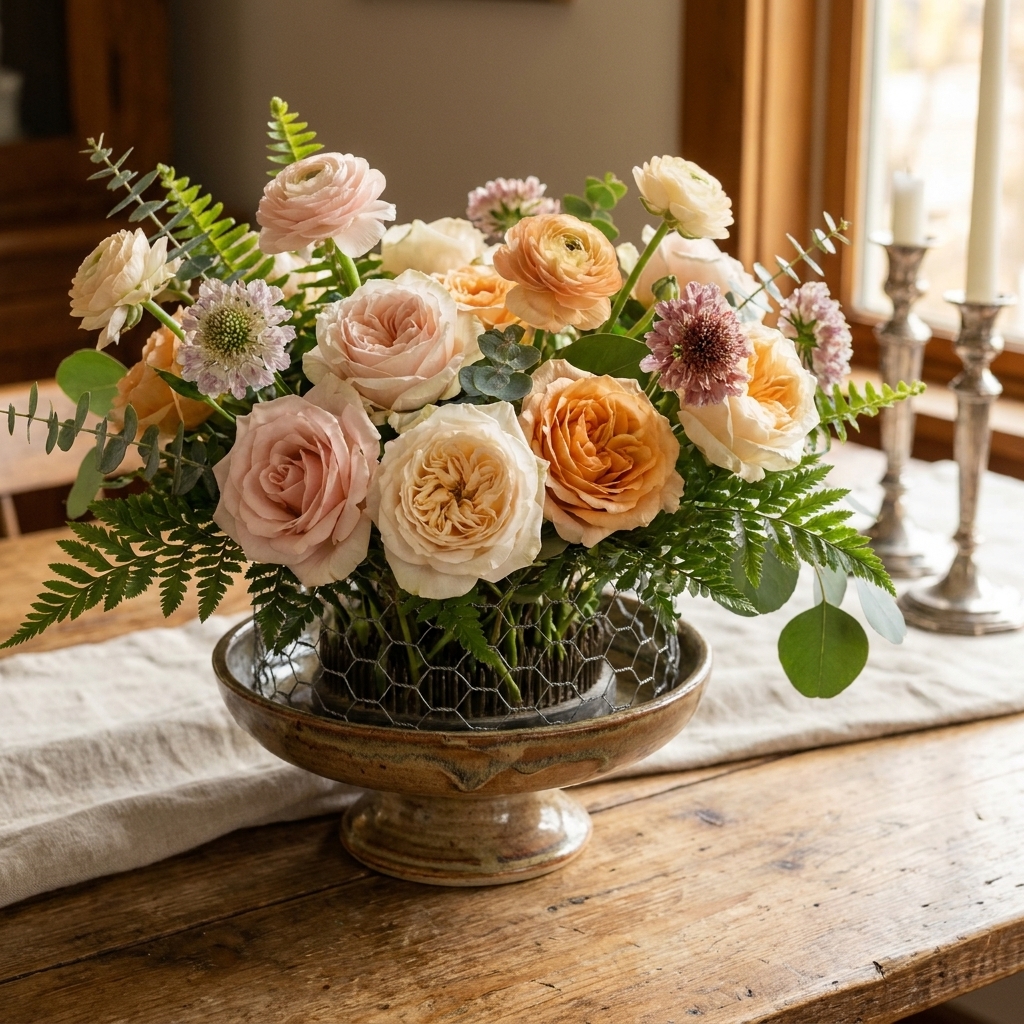
If your centerpiece mechanics are already streamlined, the table number tends to look more intentional too. I’m a big fan of chicken wire and floral frogs for arrangements that hold their shape without bulky foam. If you’re curious, see Chicken Wire and Floral Frogs for Foam-Free Centerpieces.
Readability basics
Pretty is great. Easy to spot is the point.
- Go for bold, not tall: if guests are missing numbers, increase font size or weight before you increase sign height.
- Skip fussy scripts for numerals: scripts photograph beautifully, but they can be hard to read across a room, especially for double-digit tables.
- A quick distance test: set one number on a table, walk to the room entrance, and see if you can read it without squinting. If not, add contrast or weight.
Scale and styling tricks
Keep the typography simple
One number, one font, plenty of breathing room. Tight margins and decorative swirls tend to read as busy, especially across a room.
Repeat one element from the centerpiece
This is the fastest way to make signage feel intentional:
- Pull a color from the florals into the number card
- Use the same ribbon as your napkins
- Echo your metal tone (gold or silver) in the holder
Give the number a consistent home
If Table 3’s number is floating in the flowers, Table 4’s is on a tall stick, and Table 5’s is leaning on a candle, the room starts to feel visually noisy. Pick one approach and repeat it.
Limit upright items
I like a simple rule: no more than two upright elements per table cluster. If you already have taper candles, adding a tall number stand can be one upright too many. In that case, go low with the number.
Need help getting your candle setup stable so the table still feels clean and safe? I keep my methods in How to Secure Taper Candles on Event Tables.
Table shape and traffic flow
Where guests approach matters as much as how cute the number is.
- Round tables: angle the number toward the main aisle or entry. If there are two obvious approaches, a low frame that can be read from multiple sides is your friend.
- Long farmhouse tables: place numbers near the ends or at the center line where people naturally pause, not buried mid-runner under greenery and candles.
If you’re mixing rounds, rectangles, and long tables, Tablescape Layouts for Mixed Table Shapes can help you keep it all consistent.
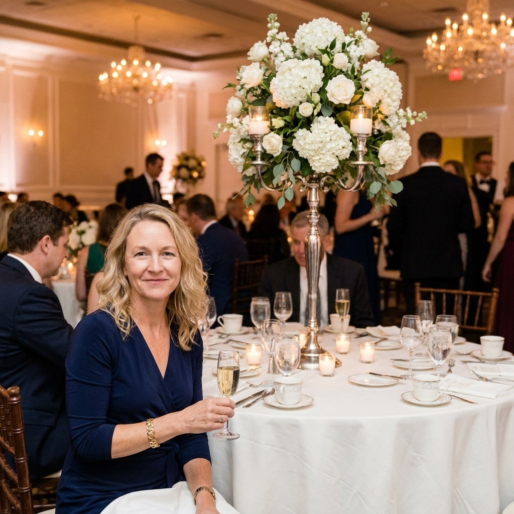
Tall centerpieces
Tall centerpieces can be stunning, but table numbers are where they often go sideways.
- Do: place the number on the base, in a low holder, right where guests approach.
- Don’t: hang the number at eye level in the middle of the structure.
- Do: keep the number slightly larger if it’s low, so guests can still spot it quickly.
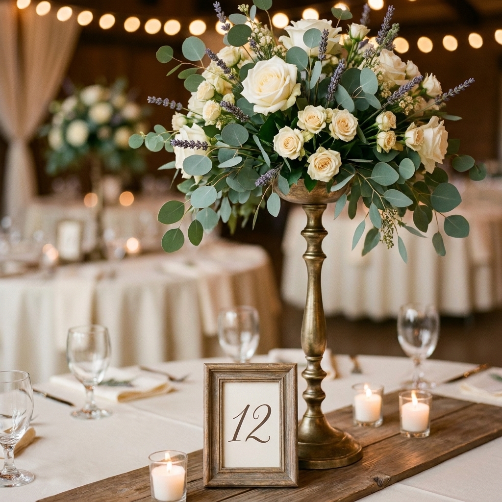
Quick troubleshooting
Problem: The number keeps tipping over
- Use a heavier holder, or add a tiny bit of museum putty under the base. Test first on venue linens and finished surfaces to avoid residue or damage.
- Switch from tall tent cards to a shorter card.
- For outdoor events, avoid super lightweight paper that acts like a sail. Low and weighty wins outside.
Problem: Guests can’t find their table
- Increase contrast (dark number on light card, or vice versa).
- Go up one size in font, not one size in sign height.
- Make sure the number faces the direction guests approach.
Problem: It looks like one more thing
- Remove a competing item (extra vase, extra candle, extra signage).
- Match the number holder material to your flatware or candleholders.
- Move the number just outside the centerpiece cluster so it has its own space.
My favorite clean formulas
Formula A: Bud vase trio + low number
- 3 bud vases (vary height slightly)
- 1 small candle
- 1 simple card in a short holder placed just beside the vases
Formula B: Compote centerpiece + number at the base
- Compote or low bowl arrangement
- Number in a mini frame or clip stand, offset at the front
- Two small votives to balance the visual weight
Formula C: Tall centerpiece + grounded signage
- Tall arrangement
- Number on the base, slightly larger font weight or higher contrast
- Keep the tabletop around it minimal so the base does not feel crowded
One last Joanna tip
When I’m setting up a room, I place the table number first and build the centerpiece around it. That one little habit keeps me from finishing a gorgeous arrangement and then awkwardly wedging a sign into the only remaining gap.
Also helpful: Layer Chargers, Plates and Napkins Like a Pro and Tablescape Layouts for Mixed Table Shapes.